by
Marcel von Maltitz

"Two things are essential in the execution of superior penmanship. They are perception and performance. The hand can not well perform that which the mind does not perceive." -C.P. Zaner, Lessons in Ornamental Penmanship, p. 8; (hereinafter, LIOP)
Correctly perceiving the shapes of Business and Ornamental Penmanship is a vital step to mastery, and can be highly challenging for the beginning student. When initially learning to write the letter shapes, one might even be unaware that perception is a skill in itself. It is most likely undeveloped in the beginning but can (and must) be trained in order for one to be successful. Failing to do so may lead to hours and hours spent learning by writing—with no or only slow improvement.
Instead, focusing on establishing a mental image of the shapes and understanding the concepts which constitute them will lead to much quicker progress. Zaner said that you can only perform what you perceive. It might be said even stronger: You can only learn and train with your muscles what your mind already understands. Everything else is trial and error.
Codes of Perception
This article has two goals. First, it aims to train your perception; it encourages you to see by specifically showing the underlying concepts and explaining the details of the shapes which constitute the letters. Secondly, on its way through a selected portion of the alphabet below, it shows practically how shapes and letters can be dissected. This should enable you to do it yourself for cases which are not addressed here.
Your aim should be to establish strong and clear concepts of letters and their shapes. When talking about concepts one could think of mental images, but I aim for something more general. In order to explain this easily, I first have to introduce a term: multi-codality. Everyone might be familiar with the term multimedia, simply meaning that something is communicated with more than one medium at the same time. For example, a movie is multimedia because it comprises a video and an audio track. Multi-codality is slightly different: It means that something (e.g. an idea or concept) is encoded in multiple ways. An example is a cooking recipe, which can be communicated using a textual description, a series of images, or a short movie. They all contain, more or less, the same information, but they communicate it encoded in different ways.
Now back to letter shapes. Even though shapes are fundamentally images, I claim that mental concepts about shapes can have different encodings. Using several complementary encodings deepens your understanding about a shape and makes it more lasting and persistent.
A first encoding is visual imagination of the shape to be learned. This one is easiest to aspire to but very hard to achieve. If your mind is able to reproduce the shapes out of itself, I dare say, you're well equipped to let your hand execute it. Directly trying to achieve this skill of mental conception is quite difficult, however. Other encodings of a letter's concepts are helpful for achieving it and are also helpful on their own:
The next encoding is reached by deconstructing letters into their individual strokes. This is what all instructional books of the old masters already do. See for example, LIOP, p. 5: "elements and principles."
Complementary to visual images and their dissection is verbal or textual description. Being able to recall a detailed description of a shape enables one to rebuilt an understanding of it, even if one forgot its image. Verbal description might draw attention to details which would have been otherwise overlooked. For example:
Describe the stroke. It's an upstroke. Which angle does it have? Around 50 degrees. Is it straight? No, it's bent to the right. How much? Well, slightly. At which point of the stroke is it bent most? Perfectly in the middle of the stroke. And so on...
There are two books which have a good deal of textual description for each shape and letter: The Arm Movement Method of Rapid Writing, by C.P. Zaner includes written descriptions of each letterform along with exercises for practicing it. Theory of Spencerian Penmanship consists almost exclusively of these descriptions.
The last encoding which I will mention here only briefly is sensation of the correct motion. Some instructional books give the good advice to retrace letter exemplars with the back of the penholder. Tracing slowly, while also using the correct muscles (i.e. no finger movement) one can acquire the sensation of how to move to get the letter right.
While reading the remainder of this article, I suggest that you refer often to the letterforms and principles shown on page 5 in LIOP.
Terminology
Lines written by a pen in the specimens will be called strokes. A connective stroke is a stroke connecting two letters. Lines drawn on the images of the first analysis section are called helper lines. The x-height is the height of the lowercase x as well as m, i, n, u, etc. The width of one space is the width of the grid on page 5 of LIOP, or the width of a single lowercase i. The main slant angle is the angle on which primary downstrokes (of m, i, n, u, etc.) are written. The connective angle is the angle on which the upstroke between letters is written.
In the following, we will overlay letters in order to see their similarities and differences. In order to make the overlay more visible, on version of the letter is colored blue, the other red. The syntax x/y: word 1/word 2 in the description means that we are overlaying x with y using the words word 1 and word 2. Here the first letter is blue and the second is red. E.g. i/u: Harris/Study means we are overlaying the blue i of Harris with the red u of Study.
Specimens
Both specimens were chosen because they were performed by two masters of penmanship and they feature high-quality writing. Furthermore, their high scan resolutions (especially the first one) allow in-depth analyses.
Both specimens are used in their original resolution. Scaling the images resulted in pixelation. While this reduced the aesthetic impression of the writing, it does not harm our analyses.
"Study both" by E.W. Bloser
"Confession of Faith" by C.E. Doner
If you get lost during our analyses below, come back here and compare the inspected overlay with the original specimens.
Shape of the i
The most fundamental letter is the i. Its basic form is a single downstroke between two connecting strokes. Getting its shape right is a fundamental achievement and solves many problems with different letters at once.
Bloser's i
The following image depicts an i as written by Bloser. I numbered the strokes:
1) connective upstroke
2) downstroke
3) connective upstroke (to an s)
I drew a straight helper line from the starting to the end point of 1. I approximated the straight direction of 2 and 3 by drawing a helper line over them.
It becomes visible that the 1 is considerably bent to the right. The point where the stroke is farthest away from the straight helper line is the middle of the stroke. 2 starts perfectly straight and stays straight about 4/5 of its length. It then turns softly into 3. Notice that 2 does not touch the baseline while still being straight. Instead, the turn is nearly finished when the stroke touches the base line. 3 is similarly bent like 1 (Remark: There is a slight difference since the next letter is an s.) It is changing its angle gradually: At the beginning of 3 for a short distance it is nearly horizontal, gradually assuming the final connective angle.

Doner's i
The following image depicts an i as written by Doner. The strokes are numbered as above. The differences to Bloser's specimen are as follows: The bend of 1 is asymmetrical, the position where the stroke is farthest away from the helper line is notably lower. The curve transitioning 2 into 3 starts considerably earlier, it is after about 2/3 of the downstroke. 3 is also starting nearly horizontally but assumes the connective slant earlier (This difference partially attributable to connecting to different letters.)

The most fundamental insights from the above analyses are:
Know how much to bend the connective strokes
Decide how much of the downstroke should be straight. A typical beginner's mistake is to transition away too early. In order to stay on slant in the downstroke one has to deliberately move to the left while going down, although it feels counterintuitive when writing a right-handed script.
Decide how round the transition between 2 and 3 should be. There is some freedom but it should not be pointy.
Deriving other shapes
In this section we start with the i which we elaborated above and aim for deriving plenty of other letters from the concept we now have of it. All images are from Bloser's specimen if not specified otherwise.
i/u: Harris/Study
In the following image the i is overlaid with the first three strokes of the u.

The u can be easily derived from the i. It aligns so perfectly that the blue i is almost completely covered by the first strokes of the red u. In other words, the stroke is simply identical. The i is a bit higher. The reason is that the u was taken from the opening line of text and the i had to be taken from the names below.
The next image aligns the second downstroke of the u with the i.

Again the overlay is perfect. The strokes are identical. Besides this fundamental insight, notice that the u itself is narrower than the inter-letter distance between the blue r and the following i; this is intentional.
We see that a u simply consists of two consecutive i's. However, the downstrokes have to be closer together than between two letters.
i/l: Harris/Taylor

Similarly, the i fits perfectly into the l. The intersection occurs at the same height as the top of the i. Although the motion of l and i are different since a loop has to be formed, the ultimate visual result below the x-height must be identical for both letters.
i/t: Harris/late

The same is true for the t. In the Bloser specimen there is a small deviation between the i and the t, but in this case we consider it to be unintentional. Similar unintentional deviations are not mentioned anymore from now on.
Realizing that these letterforms are so similar might be even unexciting. However, really having in mind that the corresponding strokes of these letters have to be identical can greatly improve consistency between them.
i/a: Harris/was

The first insight which might not be obvious is that the i is also part of the a. The first oval downstroke of the a smoothly transitions into a perfect i shape. Looking closely shows that the a starts a bit steeper from the baseline. This is unavoidable: Both the r-i connective stroke and the upstroke of the a start at the baseline and finally stop at the same point and the same slant. Since the a starts further to the right (compared to the r) it must start steeper. The top of the i is where the oval of the a began.
d/a: Madarasz/Taylor
As one might expect, the oval of the a and the d are identical. The end of the final downstroke of both are also identical.
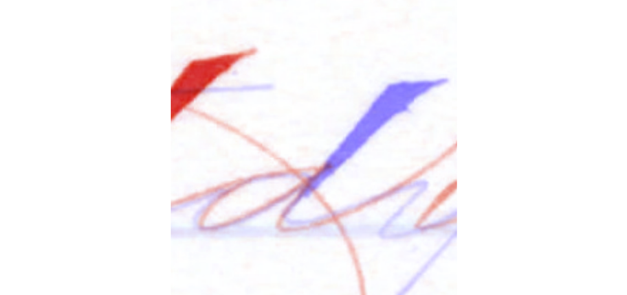
i/r: Harris/Harris

The lower case r is an interesting case since it needs more than the fundamental stroke principles. We assume that this is the reason why the r is harder to master (the same is valid for the s) and why the letter features a comparatively high variability between writers. The lead-in upstroke of the r raises notably higher than the i; additionally, it goes further to the right. This also implies that the upstroke has a stronger curvature than in the i. Then the upstroke is retraced a bit and a nearly vertical connection stroke is drawn. The retracing is vital for achieving a graceful form. For the last stroke, see the next picture.

When moving the i in the overlay more to the right, we see that it is fully embedded in the r. The final downstroke of the r is identical with the i. Also notice that both the upstroke and the downstroke of the r are nearly parallel at the top. Creating this parallel section at the top of the r is essential for its characteristic shape.
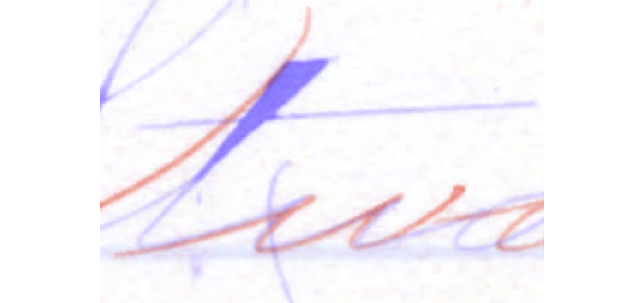
i/terminal t: Harris/but

The terminal t embeds the i upstroke. The initial upstroke is just an extension of the upstroke of the i (therefore, the t upstroke is different from the r upstroke). The downstroke is a simple stroke on the main slant angle down to the baseline. The last stroke is the part of a perfectly horizontal oval, it starts at the baseline and ends at the baseline. The highest point of the curve lies perfectly at the center of it.
u/w: Study/was
We already derived the u from the i above. The w can be easily obtained from it. The first part of the w, that is the lead-in upstroke, the downstroke and the second upstroke, simply constitute a u.

Aligning the first downstroke of the u with the second downstroke of the w, we see that the second part of the w does not constitute a u. The last (third) upstroke of the w ascends earlier, yielding a steeper curvature. We will investigate this further when considering the v.
i/n: Harris (reversed)/Darwin

We can now derive the next stroke principle from the i by rotating it by 180°. Aligned with the n we see that the reverse i is identical with the first stroke of the n.
n/m: in/some
As one might expect, the m starts identically to the n. Similarly the end (the last hump) of mand n are identical.

n/p: pen/pen

We expect that the part of the p coming after the large shaded downstroke is identical to then. We couldn't prove that using Bloser's specimen. We consider this deviation to be unintentional. Regarding Doner's specimen below (n/p: Zanerian/speaking), however, the p ends identically to the n. Additionally, it is interesting to see that the first long upstroke together with the shaded downstroke essentially have the same width as the first hump of then has.

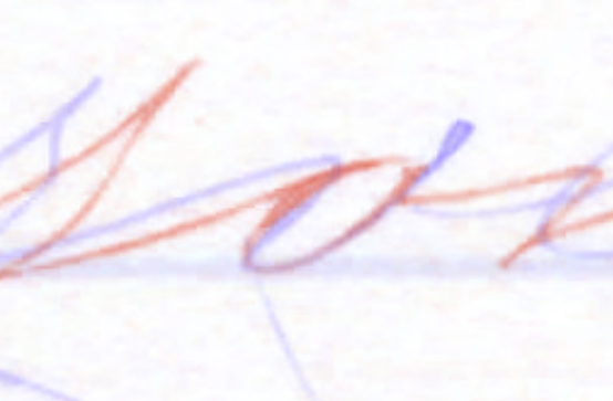
n/z: Darwin/Madarasz

When getting in touch with Ornamental Penmanship (and related scripts) one might see that most letters look as expected and only a very small set exhibits unexpected features. One is the flat oval shape of the a, another one is the shape of the z. The question why they changed these shapes can now be easily answered: They aimed for reconstructing these letters by the basic principles. This becomes visible in this image: Although it might not look like in context, the two initial strokes (lead-in and downstroke) of the z are perfectly identical to the first two strokes of the n. No new shape or stroke type had to be invented for this letter. These strokes are followed by a standard loop, solely with the exception that it first transitions a bit horizontally to the right. This is necessary in order to create a standard loop at the right place.
n/v: Doner/Carver
It is interesting to see how the v aligns to the n. They begin to be identical at the second half of the lead-in upstroke and feature the same compound curve as downstroke. Then the vextends nearly horizontally for a very small distance and then strongly ascends parallel to the compound curve. The v is visually balanced by ending it with a dot at the end of the upstroke. This is a vital difference to see compared to the u: With respect to the u, the downstrokes are on the main slant angle and the upstrokes are on the connective angle which is less steep. On the contrary, the upstroke of the v does not finally assume the connective angle but rather the main slant angle.
n/y: Doner/Taylor

The same is true when overlaying the y and the n. A difference to the v is that the y is a bit less curved than the v in the upstroke. This can also be seen here, in (v/y: Carver/Taylor). At first I wasn't sure whether this deviation was intentional or not. A look at the LIOP plate tells the intention, however: The width of the v has to be a bit smaller since the ending curve (or in Bloser’s case, the dot) has to fit in the same space. Regarding the y, there is only the full upstroke which has to fit in the space.

Doner's specimen (m/y: moulding/always) exhibits the same features. Additionally, it again shows the differing width of the letter (n) and the connection stroke between letters (a to y.) Both are identical by the half of the x-height, but the connection stroke is around 1.5 times the width of the upstroke inside the m.

h/y: highest (reversed)/always

Here we overlay the y and a rotated h. This shows that the non-loop part of the letter—that is the upstroke, the compound downstroke and the next upstroke—are point-symmetric. The loop however exhibits some degree of freedom: While the shape is rather identical, the height is not.
v/w: Carver/ways

As one might expect, the w and the v end identically. The reason for the differing height of the letters is again because the w is taken from the text body and the v from the names below it.
a/o: great/Taylor

The intention of overlaying the o with the a is not to show similarities, but rather to point out differences. The o starts higher and is consequently more curved when coming down to the baseline. The shades of both letters do not fully align. Similarly, the o does not follow thei upstroke like the a does. Instead, it ascends faster and higher.
This might remind us of the v. Having a closer look and overlaying (o/v: some/Carver) shows that the o and the v indeed begin with the same upstroke; their strokes follow each other quite closely. However, as we see in (o/v: Doner/Carver) below, there is some variation.

r/o: Harris/some

An interesting similarity is the shading of the r and the o. It first seems to be coincidental that it overlays so perfectly, but creating another overlay in Doner's specimen (o/r: for/great) shows the same similarity. It gives great insight about the slant of the downstroke of the oand the shape of the shade in the r.

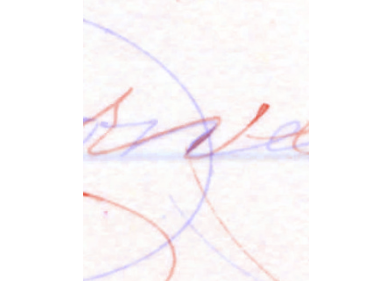
s/r: Harris/Harris

As said before, the r and the s are quite exceptional since they contain essential strokes which cannot be reduced to the common principles. Additionally, this overlay shows that they do not even exhibit the same deviations. In other words, the upstroke of the r even differs from the upstroke of the s. This is also reflected in the Doner's specimen (r/s: terms/destiny).

Conclusion
This closer look at the LIOP plate and the construction of the lowercase letters provides an insight into one of the fundamental achievements of writing systems like Business Writing or Ornamental Penmanship: the deconstruction of the entire Latin alphabet into a small and manageable number of elementary strokes. These strokes (and a few exceptions) are then sufficient to rebuild the full alphabet. Furthermore, these elementary strokes are well chosen to be naturally executable using the mechanics of the arm and hand. This reductionist, strict, and quite formal approach of developing a script and a method of writing makes me stand in awe.
Additionally, although addressing very different domains, Business Writing and Ornamental Penmanship have a close relationship: They only differ in a small set of aesthetic features, which are shading, more sophisticated uppercase letters and flourishing (also following a strict set of rules.) Besides that, they share a common fundament and feature plenty of the
same ideas and concepts.
In this article I attempted to unveil the principles of this approach and to show how well they can be rediscovered in the excellent work of the old masters. I hope this helps you to train your perception and clarifies what to aim for visually when practicing the execution of letters.